JOR'MÏTE
A B C D E G H I J K L M N O P R S T U V W Y
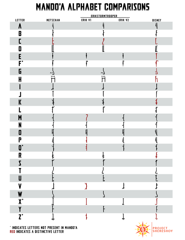
There is a major controversy regarding the Mando'a alphabet! It's very difficult to read, especially at a distance. Created in 2002 by Philip Metschan for Episode II: Attack of the Clones, it was intended to add cosmetic flavor to Jango Fett's ship and not with a fully living conlang in mind. Traviss' dictionary wasn't created for another five years in 2007.
Therefore, Joha'miitbin has done some editing to hopefully create a more usable font that is still faithful to canon.
Download our custom font here.
Download original fonts without our edits here.
How is our font different from all the rest?
Ours is based off of the redesigned version used in both The Clone Wars and Rebels, rather than the classic AotC version, which differs in several ways. We made some tweaks based off the additional letters described in MLD's expanded alphabet hosted on the mandoa.org forums, as well as some of our own artistic liberties.
Some of these liberties include adding additional letters, such as double-vowels appearing as one ligature (two letters combined into one glyph). More details on these additional glyphs can be found in our alphabet.
We also shortened each of the glyphs to avoid clipping issues. If you've tried to use either of the official Mando'a fonts in any program (excel, for example) you may have noticed that the top is frequently cut off. To understand why this occurs, we must explain certain elements of font design.
In font design, there are "ascenders" and "descenders", with each demarkated with a line in most font editing software. Uppercase and tall lowercase letters must fit between both the "ascender line" the "descender line". Above the is reserved for diacritics (accents, umlauts, etc.), while below is reserved for tails (such as those found on lowercase p and g). This is an issue because every letter in the official fonts peak above the ascender line, causing clipping in many programs.
The letter A in the official TCW font, which takes up the entire height of the ascender space.
The letter A in our modified font, which has been lowered to just below the ascender line.